
Color
This entry focuses on color as it relates to software and user interfaces.
Color is the human perception of visible light. Which color we perceive depends on the wavelength of the light, but the correspondence is abstruse. Pink is perceived as a distinct and independent color, as much so as blue or red, but is actually the combination of red and violet light. To capture colors as data, we assign them using multiple dimensions of numbers, referred to as color spaces. The seminal color space is CIE 1931, which wrapped the entire spectrum of light into a 3-dimensional space. See the image of a slice of the CIE 1931 gamut below.
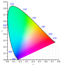
The CIE 1931 color space represents colors as X, Y, and Z values, where Y roughly corresponds to luminance, and X and Z select the hue. The most popular color spaces have been defined as a linear transform of the CIE color space. The most common color space for computer monitors is the sRGB color space. You may expect that any particular user interface, especially those that represent colors as RGB values, are using the sRGB color space. This space defines colors in terms of a red, green, and blue value, which range from 0 to 1. The space covers a wide enough range of human perception to acceptably recreate most scenes from photos and videos.
Color Blindness
Color blindness is the inability to differentiate some colors that others would. The most common is red-green color blindness, which occurs in about 4% of the population. There are almost a dozen forms of color blindness though, including Monochromacy, or “total blindness”, so accounting for color blindness in user interfaces cannot involve preparing for any particular deficiency. The only way to account for color blindness is to either provide information in other forms or to use contrast to differentiate colors.
To provide information in other forms, color may be paired with symbols to convey the same information redundantly. Symbols are slower to identify than colors, especially in peripheral vision, but their inclusion allows color blind users to still percieve the information of the interface, albeit more slowly. For most color blind users, only a few colors will collide, and so only a few simbles need to be read. If one color identifies an error, and another identifies a warning, a double or single exclamation mark may be included.
Color is often used in charts or maps to differentiate regions where the shape cannot be used symbolically. In these cases, interfaces may also allow for navigation tools to highlight different regions of color, like a pie graph where the segments separate from the rest as you hover over them. This solution has the same trade off as symbols in that it is slower to perceive, but still workable.
Contrast may also be used to help with the perception of color. Contrast is the perceived difference in brightness of two colors, with black and white having the strongest contrast. Color blind users can often still perceive contrast, and so changing contrast may be used to differentiate colors. For regions of a chart of map in particular, a black or white border may be used to help distinguish dividing lines. In fact, this approach to distinguishing regions is helpful even when color blindness isn’t an issue. Internet meme’s use white text with a black border so that their text may be perceived by all users irrespective of the background color of any particular image.
If only two colors are necessary, blue and orange may be differentiated even with the most common forms of color blindness. Though this should still be coupled with one of the other solutions above to account for Monochromacy. One common use case for this distinction is with the team colors in video games. TF2, in particular, has a red and a blue team, which appear different even with Protan, Deutran, or Tritan color blindness.